Dreams of Reality
Dev update
Hello, Cenc here,. Thought I'd give you all an in depth view at what graphical changes are comming to Dreams of Reality in the next update!
Part of Chapter Three’s release was a graphical update of the GUI. You will have noticed the start of this in the first update “Part One”. The game title and several screen titles were changed to reflect the new font and theme that I am working towards.
The next update and final part of chapter three will have more extensive changes.
Starting with the main menu, the small blue buttons have been replaced. This was something I always wanted to do, as I try to move away from the “my first photoshop” feel and have something a little more stylistic. Something that fits in with the look of the rest of the game.
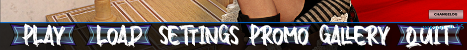
Firstly, you will see I did keep the original buttons, although I edited them to remove the text and the small ‘dots’ that appeared when you hovered over them. Now the text turns red when you hover over them whilst the blue background remains the same.
Secondly you will notice the journal has been replaced by “promo”. The journal was a nice idea, but it was made redundant by the end screen and in game relationship menus. So, this has been depreciated and the other two menus beefed up.
I’ll get to those screens shortly, however, to address the new screen “promo” this is a new section that will feature some of the renders I have done outside of the game. They will vary in quality but each one has a small information icon you can mouse over to see some text explaining the origins of the image.
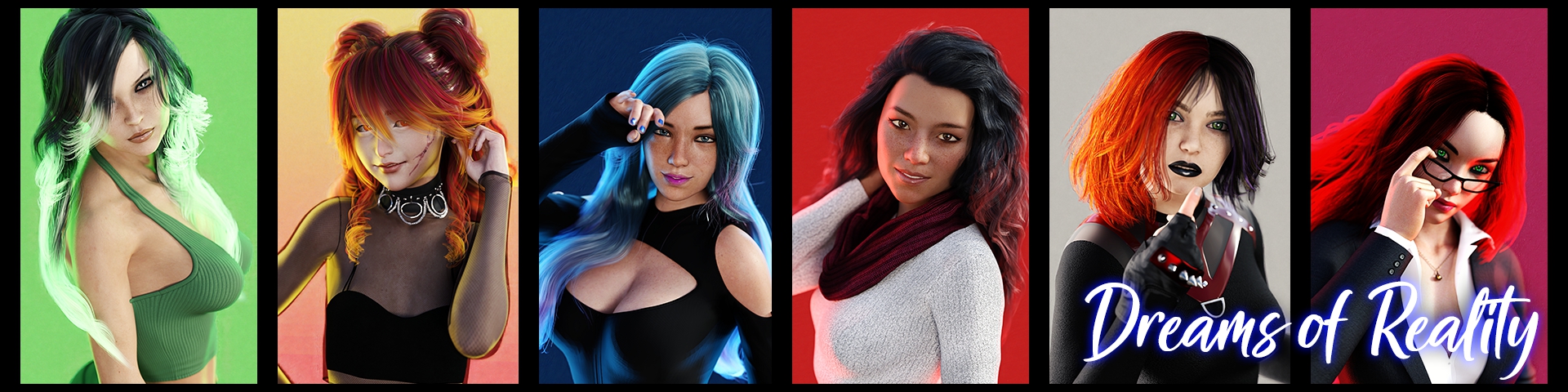
Included are some early versions of the characters used in Dreams of Reality!
I am aware the version number needs to be moved – the graphical update is very much work in progress. And of course, subject to change.
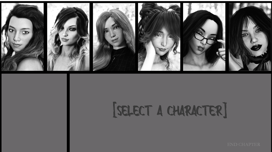
Members on the discord will have seen the work I did with the end screen, the biggest issue I had was the number of small character icons, these were starting to stretch outside of the gap left by the two images.
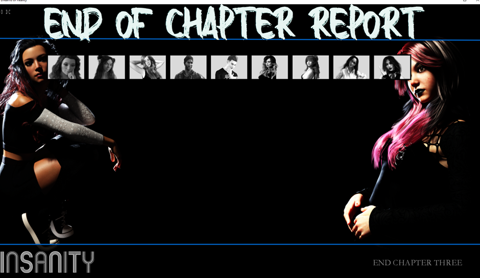
There are several ways I could deal with this, a scroll bar would be the easier answer, but this would look ugly and also would cause issues with the formatting of the text to appear below once you click on a character.
Another element I disliked was the character portraits were very small, with the removal of the journal and this end screen being redesigned I can do away with the small character images entirely. The insanity button was added in the last update, and I had originally intended it to have some notable quotes that would change depending on your level in game – this was made redundant by having an in-game insanity button that did the same thing.
The end screen now looks like this:
Each character is selectable and the screen changes colour to match each girl (they do have a colour, something many may have missed) for example Louise is pink:
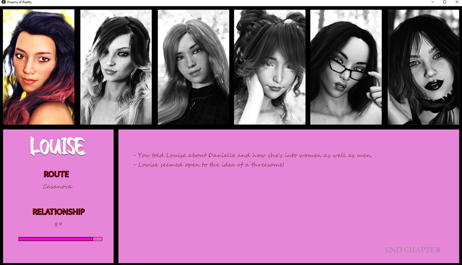
I’m debating changing the script style font as I am aware not everyone will be able to read it as clearly. But I’m happy with the look and design. When redesigning the end screen, I wanted to increase the size of the character portraits but also limit it to the six key girls in the game.
The next graphical element for me to tackle was the in-game overlay menu.

I liked the minimalist approach, however again the font didn’t match and the ‘sunny’ gradient when you mouse over them just does not fit with the current theme. So again, changing the font and simplifying the buttons further to this:
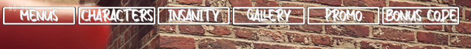
These turn blue when moused over and of course when the master “menus” button is clicked they fold away and take less screen real estate.
The eagle eyed among you will notice the ‘relationships’ button has been replaced by ‘characters’. This is the last element to have its graphical face lift.
Originally each girl was listed on screen when you clicked the relationship button, however again trying to reduce the amount of clutter on the screen I moved these into their own section.
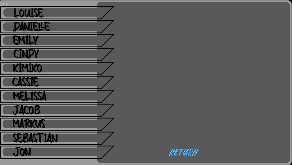
Firstly, the list has been expanded to include other key players (namely Jacob, Markus, Sebastian and Jon). Again, each character has their own unique colour and when clicking on a name the screen changes:
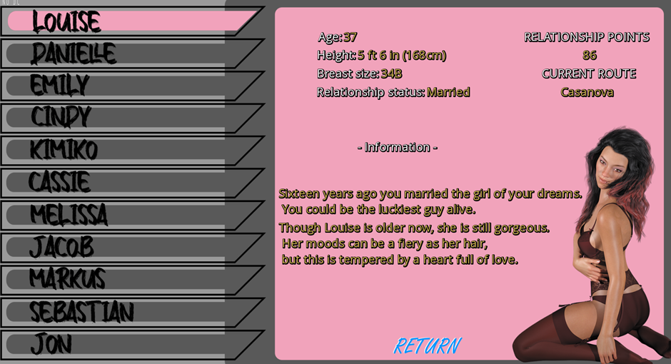
Not each character section has an image, and the information contained here is subject to change. In fact, the information will update dynamically as you play through the game.
There are still some GUI elements that I will be updating, and even some of the existing changes may … change. I hope you enjoyed reading this look at the GUI update, if you have any comments leave them below or come and join the discussion on discord.
Cenc
Leave a comment
Log in with itch.io to leave a comment.